Improving Android Accessibility with Modifiers in Jetpack Compose
Reading time: about 10 minutes
Published

The other day, I was doing some accessibility fixes on our codebase. I came across a switch that didn't have a label associated with it, meaning screen reader users would need to do a bit of guessing to get the information on what they were toggling. I wanted to fix that and started researching.
At one point, I was going through the list of modifiers for composable components and noticed that many could help make the app more accessible. I got so excited! And I wanted to share some of these modifiers with you, so here we are. I'm going to go through these modifiers:
toggleableselectableclickablemagnifier
But first, let's talk a bit about modifiers in general and what they are.
What are Modifiers?
As the Android Developers site defines modifiers:
Modifiers allow you to decorate or augment a composable. Modifiers let you do these sorts of things:
- Change the composable's size, layout, behavior, and appearance
- Add information, like accessibility labels
- Process user input
- Add high-level interactions, like making an element clickable, scrollable, draggable, or zoomable
(Source: Android Developers: Compose modifiers)
So they are a way to modify composables' looks, behavior, and semantics. They're used a lot in modern Android development with Jetpack Compose, so if you've ever tried Compose, you've probably come across them.
As the modifiers can do many things, we can use them for improving accessibility as well. Let's talk about that more in the next section.
Modifiers for Accessibility
There are many use cases for different modifiers to improve the accessibility of our apps. For example, with modifiers, we can reduce the amount of tab stops for users that use switch devices, hardware keyboards, or screen readers, or we can add more semantic information for assistive technology users in general.
We can add visual cues such as focus indicators or improve the visibility and feedback of touch interactions. A good example is what we will do later in this post by increasing the touch target size; we're also increasing the size of the ripple effect to give better feedback on actions to anyone using the app.
One thing I always want to emphasize when discussing accessibility is that when building your app, remember to test it with different assistive technologies. You might find that some things are not working as expected - that's precisely what happened to me when I was writing the code for this blog post.
Oh, and speaking about the code, if you want to see it, you can find the repository for Modifiers Example App here.
In this section, we will look closer at the modifiers I listed at the beginning of the blog post. Let's start with clickable.
Clickable
Clickable-modifier, as the name states, makes the element clickable. This utility can be useful when creating, e.g., lists of items that need to be clickable or if some larger area needs to be clickable.
However, if you're creating a plain ol' button, I advise using the Button-component because it already has the semantics and behaviors built in and is accessible by default.
Let's consider an example of a list where the user needs to be able to bookmark an item on the list. This picture shows what we are building:
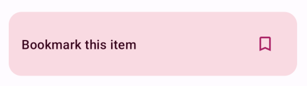
As seen in the picture, there is a row with text ("Bookmark this item") and a bookmark icon. One option is to wrap the icon with the IconButton component:
Row(
    modifier = Modifier
        .fillMaxWidth()
        .clip(MaterialTheme.shapes.large)
        .background(MaterialTheme.colorScheme.primaryContainer)
        .padding(ClickableScreen.padding),
    horizontalArrangement = Arrangement.SpaceBetween,
    verticalAlignment = Alignment.CenterVertically,
) {
    Text(
        text = "Bookmark this item",
        style = MaterialTheme.typography.titleMedium,
        color = MaterialTheme.colorScheme.onPrimaryContainer
      )
      IconButton(onClick = { onClick() }) {
          FavouriteIcon(
              icon = icon,
              contentDescription = "Bookmark this item"
          )
      }
}
This code snippet would work, and when a user taps the icon button, the item would get bookmarked. However, the area where the user can tap is small. It would be easier to tap the whole row.
Let's make a couple of changes:
Row(
    modifier = Modifier
        .fillMaxWidth()
        .clip(MaterialTheme.shapes.large)
        .background(MaterialTheme.colorScheme.primaryContainer)
        // Add clickable-modifier with the role of Button
        .clickable(
                role = Role.Button,
          ) {
                onClick()
          }
        .padding(ClickableScreen.padding),
    horizontalArrangement = Arrangement.SpaceBetween,
    verticalAlignment = Alignment.CenterVertically,
) {
    Text(
        text = "Bookmark this item",
        style = MaterialTheme.typography.titleMedium,
        color = MaterialTheme.colorScheme.onPrimaryContainer
    )
  // Remove IconButton.
  // The content description is not needed anymore
  // as the whole element is merged and text serves as a label
   FavouriteIcon(icon = icon, modifier = Modifier.padding(12.dp))
}
This change improves the accessibility of the modifier a lot. It increases the touch target size and adds the role of a button so that assistive technology users will know it's a button.
This modifier works well if you need to perform a single click. However, if you'll need a double click and/or a long click in addition to a single click, combinedClickable is your friend.
Selectable
Another modifier we can use for improving accessibility and usability is selectable. It's often used as part of a mutually exclusive group - such as a radio button group.
There are a couple of benefits to wrapping the whole row with this modifier (instead of, e.g., using a button or clickable-modifier): The area where a user can tap and select the item is larger, you can add correct semantics for the element so that assistive technology users get relevant information and the items can be grouped easily.
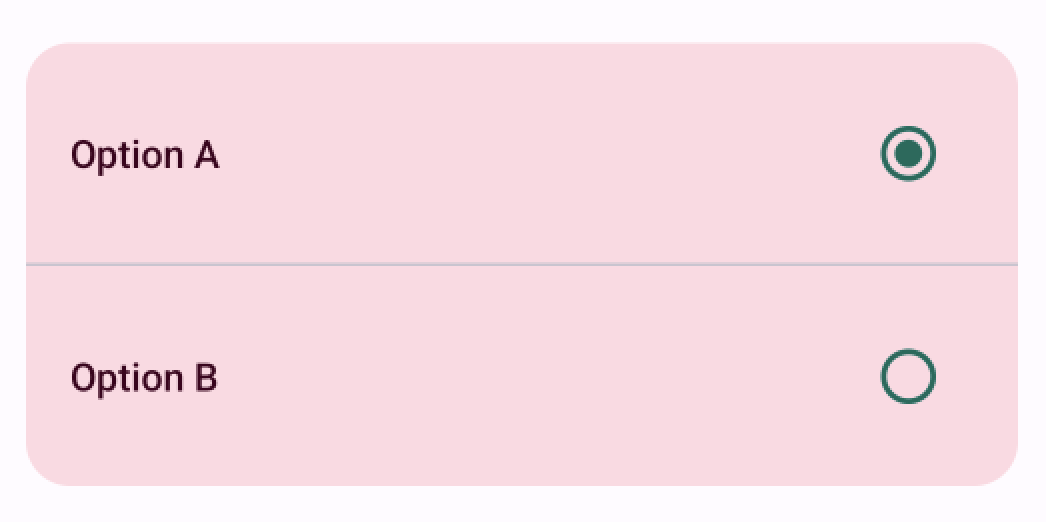
Let's talk about how to improve an example I've seen in several places. The picture shows what we're building:
And here's the simplified code (not copied from any of the codebases mentioned above):
@Composable
fun RadioInputRow(text: String, checked: Boolean, onChange: (String) -> Unit) {
    Row(
        modifier = Modifier
            .fillMaxWidth()
            .padding(16.dp),
        horizontalArrangement = Arrangement.SpaceBetween,
        verticalAlignment = Alignment.CenterVertically,
    ) {
        Text(
            text = text,
            style = MaterialTheme.typography.labelLarge,
            color = MaterialTheme.colorScheme.onPrimaryContainer
        )
        RadioButton(
            selected = checked,
            onClick = { onChange(text) },
            colors = RadioButtonDefaults.colors(
                selectedColor = MaterialTheme.colorScheme.tertiary,
                unselectedColor = MaterialTheme.colorScheme.tertiary,
            ),
        )
    }
}
This code snippet works, but a user needs to be able to tap the radio button, which has a small touch target size. Let's make a couple of modifications to make the code more accessible:
@Composable
fun RadioInputRow(
    text: String,
    checked: Boolean,
    onChange: (String) -> Unit
) {
    Row(
        modifier = Modifier
            .fillMaxWidth()
        // We add a selectable modifier with state and role to the row
           .selectable(
               selected = checked,
               enabled = true,
               role = Role.RadioButton,
               onClick = { onChange(text) },
            )
            .padding(16.dp),
        horizontalArrangement = Arrangement.SpaceBetween,
        verticalAlignment = Alignment.CenterVertically,
    ) {
        Text(
            text = text,
            style = MaterialTheme.typography.labelLarge,
            color = MaterialTheme.colorScheme.onPrimaryContainer
        )
        RadioButton(
        // We clear the semantics from
        // the RadioButton, so that the user,
        // who is using assistive technology,
        // doesn't have an extra tab stop on the way.
            modifier = Modifier.clearAndSetSemantics {},
            selected = checked,
            onClick = { onChange(text) },
            colors = RadioButtonDefaults.colors(
                selectedColor = MaterialTheme.colorScheme.tertiary,
                unselectedColor = MaterialTheme.colorScheme.tertiary,
            ),
        )
    }
}
This way, the click area is more extensive, and it's easier to hit and select the target. For this example, I decided to keep the Material Theme's RadioButton-component, but we could also switch it to two icons (selected and unselected), the same way as in the clickable-example.
There are a couple of things to note about the semantics of this example. First, the whole row gets the selectable-modifier, and we pass the state (enabled, selected) to it, and we also pass the role of a switch to it. This way, we can ensure that assistive technology gets correct information about the element, and users will know how to interact with it.
Another aspect related to semantics is to clear all semantics from the original RadioButton-element. If we don't do it, the user will encounter the same component with the same info twice - first on the container (Row) and then with the radio button. That also means an extra tab stop for anyone navigating with assistive technology using focus order.
We want to make one more change and add the selectableGroup-modifier to the parent component that is wrapping all the radio input rows:
Column(
    modifier = Modifier
        ...
    // Adding the selectableGroup here:
        .selectableGroup(),
    verticalArrangement = Arrangement.SpaceBetween,
) {
    inputs.map { input ->
        RadioInputRow(
            text = input,
            checked = selected == input,
            onChange = { selected = it }
        )
        ...
    }
}
This way, users using, e.g., a screen reader, get the information that there is x number of items in the list as an option to select.
Toggleable
Like selectable, the toggleable- modifier helps make components more accessible. toggleable can be used when there is a state with two values - like selecting a setting with an option to be on or off.
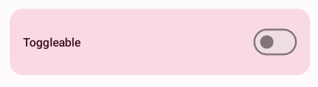
For this example, we have a row with text and a toggle at the end:
And the code we have at first looks like this:
fun SwitchRow(
    text: String,
    checked: Boolean,
    onChange: (Boolean) -> Unit
) {
    Row(
        modifier = Modifier
            .fillMaxWidth()
            .padding(16.dp),
        horizontalArrangement = Arrangement.SpaceBetween,
        verticalAlignment = Alignment.CenterVertically,
    ) {
        Text(
            text = text,
            style = MaterialTheme.typography.labelLarge,
            color = MaterialTheme.colorScheme.onPrimaryContainer
        )
        Switch(
            checked = checked,
        onCheckedChange = { onChange(it) }
        )
    }
}
In this code snippet, the touch target is only the area of the Material Theme's Switch-component, as it was with the example of the selectable-modifier. Also, other similar problems (as mentioned in the selectable-section) are present. So, we'll make a couple of changes to make this component more accessible:
@Composable
fun SwitchRow(
    text: String,
    checked: Boolean,
    onChange: (Boolean) -> Unit
) {
    Row(
        modifier = Modifier
            .fillMaxWidth()
        // We add the toggleable modifier
        // with the state (value) and role
            .toggleable(
                 value = checked,
                 role = Role.Switch,
                 onValueChange = { onChange(it) },
            )
            .padding(16.dp),
        horizontalArrangement = Arrangement.SpaceBetween,
        verticalAlignment = Alignment.CenterVertically,
    ) {
        Text(
            text = text,
            style = MaterialTheme.typography.labelLarge,
            color = MaterialTheme.colorScheme.onPrimaryContainer
        )
        Switch(
              checked = checked,
              onCheckedChange = { onChange(it) },
              // We clear the semantics
              modifier = Modifier.clearAndSetSemantics {}
        )
    }
}
It has a value attribute as part of its state. For toggleable, the role is usually Switch - compared to selectable's RadioButton.
Magnification
The final modifier in this blog post is different from the others. You can use this modifier for magnification in your app. However, it's important to note that in many cases, the operating system's magnification is sufficient, and people who need it know how to use it (and do use it). But this might be useful in some cases, not just for those who use the os's magnification but for anyone who needs to magnify a part of your UI.
For the magnifier modifier to work correctly, the Android's Magnifier widget needs to have support on the device. Before proceeding, we'll want to check that:
if (!MagnifierStyle.Default.isSupported) {
    Text("Magnifier is not supported on this platform.")
} else {
    // TODO
}
The magnifier-modifier needs to know the center of the magnified area. We can get that information from the pointerInput-modifier's dragDetectedGestures function. We want to store the value of the center to a variable:
var magnifierCenter by remember {
    mutableStateOf(Offset.Unspecified)
}
Then we'll wrap the area we want a user to be able to magnify with a Box element and set the modifiers:
Box(
Modifier
// Set the source center and styles for the magnifier
.magnifier(
sourceCenter = { magnifierCenter },
zoom = 3f,
style = MagnifierStyle(
size = DpSize(height = 200.dp, width = 300.dp),
),
)
.pointerInput(Unit) {
detectDragGestures(
// Show the magnifier in the initial position
onDragStart = { magnifierCenter = it },
// Magnifier follows the pointer during a drag event
onDrag = { _, delta ->
magnifierCenter = magnifierCenter.plus(delta)
},
// Hide the magnifier when a user ends the drag movement.
onDragEnd = { magnifierCenter = Offset.Unspecified },
onDragCancel = { magnifierCenter = Offset.Unspecified },
)
},
) {
Text(
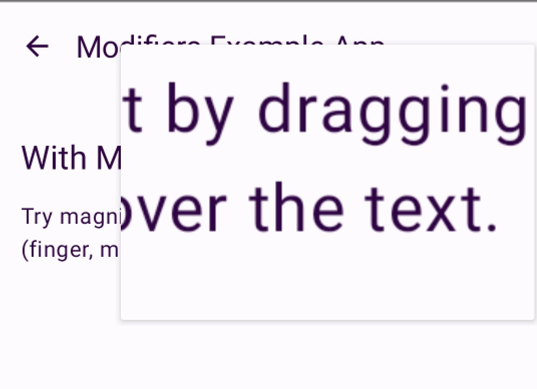
"Try magnifying this text by dragging a pointer (finger, mouse, other) over the text.",
)
}
So, with this code snippet, this is what we get:
Wrapping Up
In this blog post, we've discussed modifiers and accessibility in general, and we've looked more closely into four modifiers: clickable, selectable, toggleable, and magnifier. This post was not a comprehensive one on accessibility and modifiers, and I've intentionally left out some topics like focus management and hardware keyboards entirely. I'm planning to write blog posts about those themes later.
Do you have any thoughts, ideas, or questions? Let me know!