More Accessible Graphs with Jetpack Compose Part 3: Differentiating without Color
Reading time: about 5 minutes
Published

More Accessible Graphs with Jetpack Compose (4 part series)
- 1. More Accessible Graphs with Jetpack Compose Part 1: Adding Content Description
- 2. More Accessible Graphs with Jetpack Compose Part 2: Adding Keyboard Interaction
- 3. More Accessible Graphs with Jetpack Compose Part 3: Differentiating without Color
- 4. More Accessible Graphs with Jetpack Compose Part 4: On-Screen Control Buttons
This blog post is the third one in my series on more accessible graphs with Jetpack Compose. You can find the previous two from the following links:
- More Accessible Graphs with Jetpack Compose Part 1: Adding Content Description
- More Accessible Graphs with Jetpack Compose Part 2: Adding Keyboard Interaction
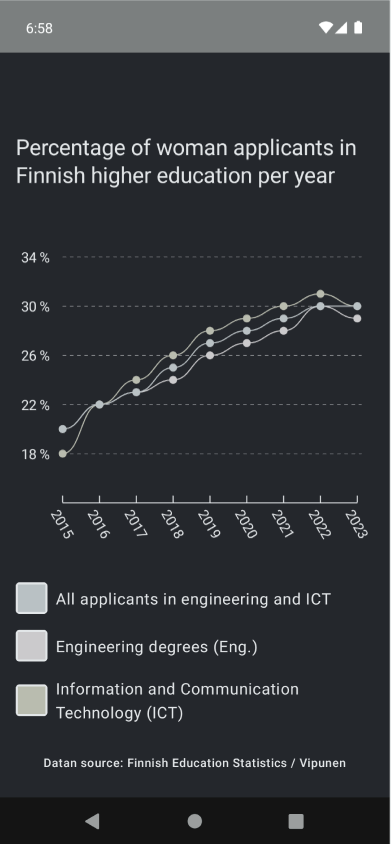
The third topic we will cover is differentiating data by other means than color. Color is a convenient way to distinguish data, but what if you can't see color? Or what if you see colors differently? For example, the example project we've been developing during the blog post series would look like this for someone who can't see color at all:
And someone with red-green color blindness:

Another aspect of why not use color alone is that phone screens display color differently. A noticeable difference on a high-end external screen for a designer might be almost the same shades for a lower-end phone, making usage impossible.
There are better ideas than just using color to differentiate data. In the next section, let's explore some of these other ways.
Options for Color
When talking about graphs, there are generally two ways to improve the distinguishability of data: Shapes and patterns. For example, if a bar chart is initially differentiated by color, adding patterns for different colors could differentiate those bars.
For a line chart, both these options are valid. Let's explore both and differentiate the data by adding different shapes for points and some patterns for the line. This solution is not the most beautiful because I'm mixing these two options, but it's there to demonstrate, not to be a final design.
The Code
In the situation we're starting with, the function we're using to draw the data points looks like this:
drawPoints(
    points = pixelPoints.map { Offset(it.x + 20f, it.y) },
    pointMode = PointMode.Points,
    color = color,
    strokeWidth = 8.dp.toPx(),
    cap = StrokeCap.Round,
)
It takes the points and point mode from the parameters, and other than that, everything is defined inside the helper function. In this example, we're interested in the strokeWidth and cap-properties because we're using them to change how the data points are drawn. In addition, we will modify the code for drawing the path between the data points by adding an additional style.
Let's get started with changing the shape of the data points. First, let's add new parameters for the drawData-extension, which encapsulates the data points and line's drawing methods:
fun DrawScope.drawData(
    ...
    strokeWidth: Float = 8.dp.toPx(),
    strokeCap: StrokeCap = StrokeCap.Round
) { ... }
We add two new parameters: strokeWidth and strokeCap, and then set the current values as defaults. Then we use these new properties in the code:
drawPoints(
    ...
    strokeWidth = strokeWidth,
    cap = strokeCap
)
Note: We add these for both of the drawPoints-methods, as there is one for highlighted points and one for all points.
Then, in the Graph-composable, we add the actual differentiation for each data set:
drawData(
    ... // Engineering data
    strokeCap = StrokeCap.Round,
)
drawData(
    ... // ICT-data
    strokeCap = StrokeCap.Square,
)
drawData(
    ... // Total data
    strokeCap = StrokeCap.Butt,
    strokeWidth = 12.dp.toPx(),
)
As we set the defaults, we don't need to pass a value for both parameters if the value is the default value. That's the case for the ICT and Engineering data, as we want to keep the point size the same. Actually, we wouldn't need to pass the strokeCap-value for the Engineering data either for the same reason - but I chose to add it for clarity and to display the different values.
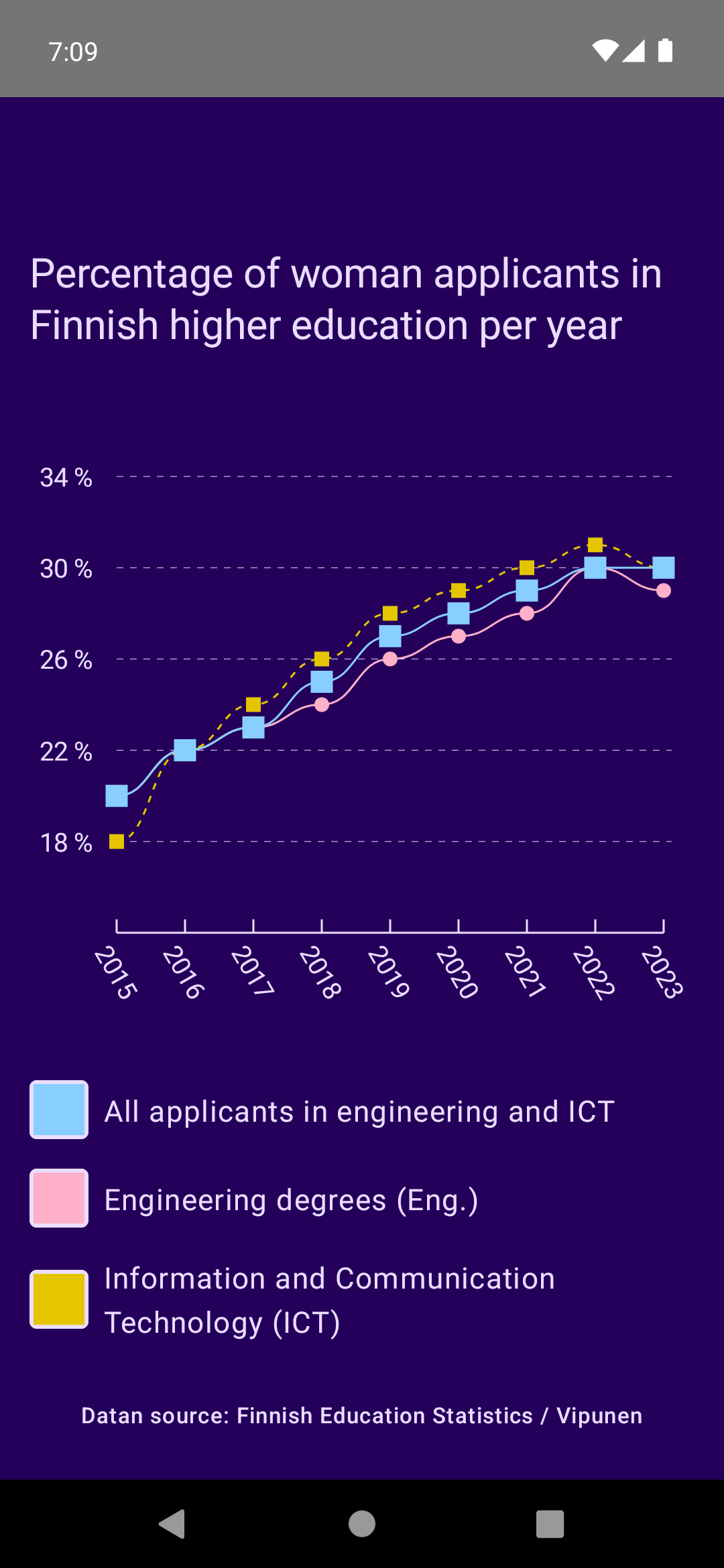
Okay, after these changes, the points look different. For Engineering data, nothing has changed, but for ICT data and total data, the points are rectangular, and the total data has more significant points than the others.
Let's add another differentiator before we look at the results. We want also to be able to distinguish the lines from each other, and one way to do that is by changing the pattern of the line. In this example, we will add a dashed line for one of the data sets.
Let's start with adding another new parameter for drawData:
fun DrawScope.drawData(
    dashed: Boolean = false,
) { ... }
The new parameter is dashed, and it's set to false by default. When it's true, we want to change the style of the path that we're drawing:
drawPath(
    path = path,
    color = color,
    style = Stroke(
        width = 3f,
        pathEffect = if (dashed)
            PathEffect.dashPathEffect(floatArrayOf(10f, 10f), 0f)
        else null
    ),
)
We add thepathEffect for the stroke and set it to a dashed path effect with intervals of 10f. If dashed is false, then we don't set the path effect - or we set it to null, which is its default value.
The last thing to do is to pass the value to one of the drawData-functions, and in this case, we pass it to the ICT data:
drawData(
    ... // ICT-data
    strokeCap = StrokeCap.Square,
    dashed = true
)
And with that, we have added both shapes and a pattern. The final implementation looks like this:
You can find the final code from this commit.
Wrapping Up
In this blog post, we have looked at improving differentiating data by other means than color. We've covered adding shapes and patterns by changing the data points in the line chart to have different shapes and adding a dashed pattern to one of the lines.
The fourth post in this series will cover switch devices and how navigation should work with them. Publishing it will take some time - I'll need to find out why it wasn't working with the solution it should have.