Accessibility Checks with Jetpack Compose Previews
Reading time: about 8 minutes
Published
Now that Android Studio Iguana is out and stable, I wanted to write about one feature it provides and I'm excited about: Accessibility checks with Compose previews. This feature is part of the new UI checks for Jetpack Compose, and in this blog post, I'll introduce you to how to use it and provide examples of the issues it finds.
Compose UI Checks
UI Checks is a new feature shipped with Iguana. It provides a visual way of auditing your app with different screen sizes, font sizes, dark and light themes, and testing accessibility. It works similarly to how visual linting and accessibility checks integrations work for views.
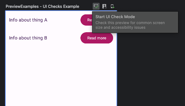
Previews have this "Start UI Check Mode"-button at the top right corner:
After turning the feature on, it runs the checks and shows all the configurations with problems. If no issues are present, the preview UI doesn't show anything. Here is a picture of what the UI checks mode shows for me from one of the example checks I'll talk about in a bit:
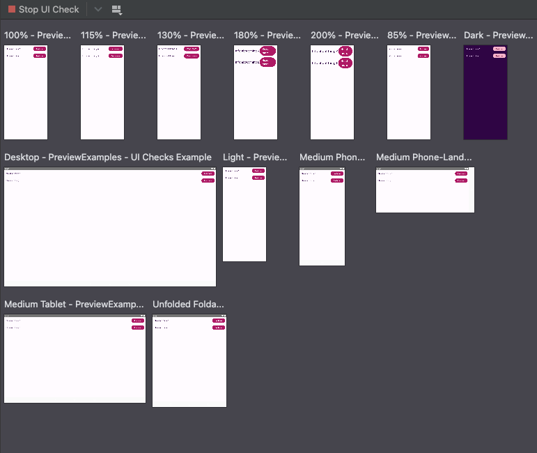
It's an overview picture on purpose, so the quality is not good enough to see the details if you try to zoom in.
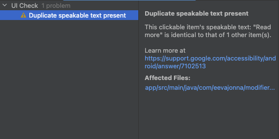
You can find the problems the checker finds in the "Problems"-panel:
Accessibility Checks
The accessibility checks the UI checks mode runs are the same as, for example, Accessibility Scanner and Accessibility checks integration for views.
It checks content labeling, implementation, touch target size, and low contrast categories. You can find more information about each category and its contents in Android Accessibility Help's article Accessibility Scanner results. The contents on that page are pretty much view-related, but each item in the categories has a "learn more" link, and many of them have examples with Compose as well.
One note, though: I was trying to reproduce some of the problems the checks should catch, and it didn't flag them. I think I've seen these false negatives (and some false positives) with the Accessibility Scanner app, which makes sense as they use the same API.
Let's dive deeper and discuss some example findings from the accessibility checks and how to fix them.
Examples
Duplicate Speakable Text Present
The first problem we will look at is "Duplicate Speakable Text Present". To demonstrate it, I've created a small component. It has two rows with a text and a button with text "Read more". The component is visible in the picture showing where you can turn on the UI Checks.
The description for the error is:
This clickable item's speakable text: "Read more" is identical to that of 1 other item(s).
Why is this a problem? Different assistive technologies and their users rely on content labels to navigate and understand the content. I'll give two examples of having two (or more!) duplicate clickable items and how they can be a problem.
First, a user who uses Voice Access for navigation would probably say "Tap Read More" when they want to activate that "Read more" button. But if there is more than one "Read more" button, Voice Access will ask which one. The user would need to pick the one by saying the number with which Voice Access has annotated it. Every time there is a similar situation, it slows the user down and decreases the user experience. Also, it means that they need to speak more to control the device, which might not be a problem when it's one time, but if that is repeated multiple times, it might become a problem.
Another example is screen reader users. They often navigate either linearly or use Touch to explore with TalkBack. If the user interface contains multiple elements with the same text label, distinguishing between the elements can be challenging.
So, how do we fix it? The answer is technically simple but might not be straightforward: The text in clickable elements must differ.
In this case, a solution could be to change the texts from "Read more" to "Read more about A" and "Read more about B". I mentioned that the solution may not be straightforward because it touches the copy, and we, as developers, don't always have control over it.
No Speakable Text Present
The next example I'm giving is an example of no speakable text present. The error description is:
This item may not have a label readable by screen readers.
One way to reproduce the problem and trigger this warning is to have an image or icon with an empty string in the content description:
Icon(
  ...
  contentDescrption=""
)
The problem is that if there is no speakable text present, then there is no text label for that element. Let's say this is an icon button with just this one icon element as a child. A screen reader user would hear that there is a button, but it doesn't have a label. They would not know what to do with that button because they wouldn't see the visual cues.
Fixing this depends on the icon - if it's purely decorative (for example, it accompanies an action to illustrate it), the content description can be null. But if it's the only thing, for instance, in a button (so, an icon button), it needs to have a descriptive label that communicates the action for the button.
If you're interested in reading more about content descriptions, I've written a blog post about content descriptions and how to write them: How to Add Content Descriptions in Compose - A Guide for Android Devs
Insufficient Color Contrast Ratio
The third check is about color contrast. This check is actually twofold - image contrast and text contrast. The error description for the text-related issue is:
The item's text contrast ratio is 4.16. This ratio is based on an estimated foreground color of #8E7098 and an estimated background color of #FFFBFF. Consider using colors that result in a contrast ratio greater than 4.50 for small text, or 3.00 for large text.
So, I have a component with regular-sized text on a background, with colors that don't have enough contrast.
Why is this a problem? It's because of visibility. If there is not enough contrast between the background and the text or image, some users might not be able to read the text or see the image. This problem concerns people with different vision-related disabilities and people with cognitive disabilities, to name some groups. Furthermore, it can affect every single user. Have you ever tried using your phone in direct sunlight, and an app didn't have enough contrast to see the text?
Images should have a minimum contrast ratio of 3.0:1 between the image and the background. Text, on the other hand, should have a minimum of 3.0:1 for large text and 4.5:1 for small text. You can read more about color contrast and requirements from WebAIM's article Contrast and Color Accessibility
It's common to come across cases where there isn't enough contrast in the actual themes, especially when the app has both light and dark themes and has not been tested well enough. Some color combinations might work well with light themes, but their dark-theme counterparts don't have enough color contrast, or vice versa.
To fix the issue, the contrast between the background and texts or images must be increased. However, increasing the contrast may not be straightforward, as developers don't always have control over the color choices for the UI elements.
Touch Target
The final check I'm writing about is for touch targets. The error description is:
This item's height is 35dp. Consider making the height of this touch target 48dp or larger.
In this case, I've created a button with a fixed height, which is why the touch target size is not high enough. The recommended touch target size minimum is 48dp x 48dp to ensure it's easier for anyone to press that touchable item. If, for example, a user has tremors in their hands, the bigger the touch target, the easier it is to tap it.
So, to fix the issue, you'll need to ensure that the touch target size is at least 48dp in width and 48 dp in height. Material Theme components should provide this out of the box - but if you're required to create custom implementations of buttons and other elements, remember to make sure they're at least 48dp x 48dp in size.
Wrapping Up
In this blog post, we've looked at Compose UI Checks and how they can help with catching some accessibility issues in your app. While they are useful, it's important to remember that using them does not guarantee that your app is fully accessible. They might render some false positives or negatives, meaning that they either find issues where there are none or don't find issues that are present. And they catch only a small subset of accessibility issues, so more extensive testing is needed.
That being said, I'm happy about this new tool for finding accessibility issues during development without any additional tools like Accessibility Scanner (which is a great app!). It's usually more probable that the tools get used if they don't need extra effort.
Have you tested the UI Checks yet? How was it? Did you find something expected or unexpected?