Compose UI Tests for Larger Font Sizes: Scrolling and Text Truncation
Reading time: about 7 minutes
Published
While testing Android apps for accessibility, one of the biggest problems I’ve encountered are with larger font sizes. They’re usually not properly supported: content overlaps when font sizes increase, scrolling isn't enabled to accommodate growing text, or text is truncated without a way for the user to expand it.
I’m often asked tips on writing accessibility tests for Android, and I decided to write this post to demonstrate how to test some of those larger font size issues with UI tests. In this blog post, we’re looking into writing tests to verify that scrolling is enabled when needed and that truncated text can be expanded.
Let’s first discuss the screen I wrote to test these issues.
The Screen We’re Testing
I created an example screen with Compose to demonstrate tests in this blog post. It’s a Scaffold that wraps a LGBTQ+ Glossary of different gender identities and sexual and romantic orientations. If this were an actual app, there would be a separate screen for each of these categories, listing all the data. On this screen, only the first four are displayed, except for romantic orientation, which shows only the first two.
This is what the screen looks like with 100% font size (so, the default one):
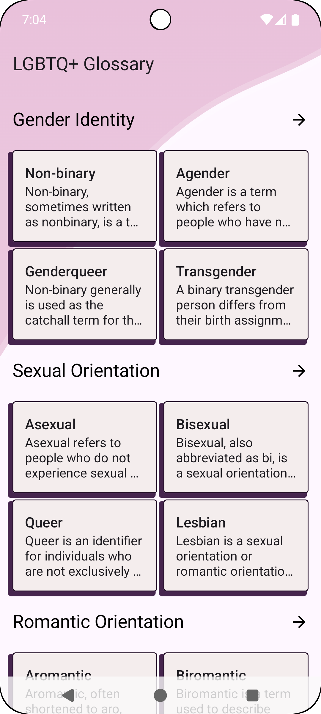
Note that with the default font size, all content fits the screen, and no scrolling is needed. However, when the font size increases and text takes up more space, the content should be scrollable to accommodate that.
The content of the screen, explaining Non-binary, agender, genderqueer, transgender, asexual, bisexual, queer, lesbian, aromantic, and biromantic terms, is copied from the LGBTQIA+ Wiki 🏳️🌈🏳️⚧️. If you’re interested in learning more, you’ll find much more information on the link.
Testing Setup
Before we can start writing the tests, we need to do a bit of setup.
As the default UI tests are run against the default font size (100%), we need a way to specify the font size as 200% for the tests. There are several ways to do it. In this blog post, we’re going to use something rather straightforward: Composition local.
In our test class, let’s first get the Compose test rule:
class LargeFontSizeTests {
    @get:Rule val composeTestRule = createComposeRule()

}
And then create a function we can call in both of our tests to set content for testing:
fun setupScreen() {
    composeTestRule.setContent {
        AccessibilityTestsTheme {
            LargeFontScreen()
        }
    }
}
LocalDensity is a composition local which provides information about the screen’s density and font scale. Using it to change the tests’ font scale is a good strategy because it keeps the tests isolated and doesn’t require additional dependencies.
Let’s wrap our screen with CompositionLocalProvider, providing a new fontScalevalue for LocalDensity:
CompositionLocalProvider(
    LocalDensity provides Density(
        fontScale = 2f,
        density = LocalDensity.current.density
    )
) {
    LGBTQGlossaryScreen()
}
Now that we have the tests set up for larger font sizes, let’s move on to the actual tests and start by testing if the content is scrolling.
Scrolling Content
When a screen doesn’t have much content, it might be built in a way that it can’t be scrolled. Developers often develop with font size set to default (or even smaller), with phones that have big screens, so it might feel natural not to add scrolling to the screen.
However, when users increase the font size and/or screen size in accessibility settings, the content takes up more vertical space. So, for users, the ability to scroll is often needed to see all the content on the screen.
To write a UI test for this scenario, we’ll need to do three things on the screen: first, check that the last item is not visible to assert that scrolling is needed; then, swipe up; and finally, check that the last item is visible. In code, it would look like this:
@Test
fun contentIsScrolling() {
    setupScreen()

    composeTestRule
        .onNodeWithText("Biromantic")
        .assertIsNotDisplayed()

    composeTestRule.onNodeWithTag("screen-content")
        .assertIsDisplayed()
        .performTouchInput { swipeUp() }

    composeTestRule
        .onNodeWithText("Biromantic")
        .assertIsDisplayed()
}
In the test, we first call the setupScreen helper we defined in the previous section, and then assert that the last item (the card with the title “Biromantic”) is not visible. Then, we get the screen content node, check that it’s visible, and perform a swipe-up action. The final block checks that the card with the “Biromantic” title is now displayed.
The other scenario we’re going to test in this blog post is about text truncation. Let’s discuss it next.
Truncated Text
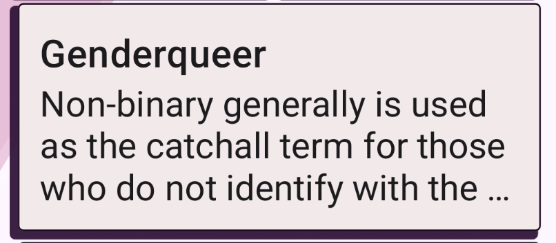
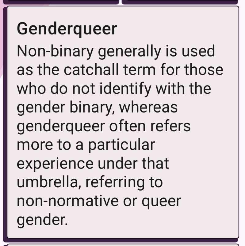
The other problem I see a lot with larger font sizes is that when the text doesn’t fit its container, it's truncated with an ellipsis, and there is no way to see the rest of the text. If this truncation strategy is used, there should always be a way to expand the text. I’ve written a blog post on the topic, so if you’re interested in reading more about the problems text truncation can create, here’s a link: The Problem of Trun...
In the example I created for this blog post, card texts are truncated with an ellipsis, and when the user clicks the card, the full text is displayed. So, for example, with genderqueer, the truncated version looks like this:
and the full version looks like this:
Helper Methods
Alright, and then the tests. We’ll want to write a couple of helper methods to make the code more readable.
SemanticsNode.isTruncatedWithEllipsis()
Let’s start with a check for a semantics node for if it is truncated with ellipsis:
fun SemanticsNode.isTruncatedWithEllipsis(): Boolean {
    val textLayoutResult = mutableListOf<TextLayoutResult>()
    this.config
        .getOrNull(SemanticsActions.GetTextLayoutResult)
        ?.action
        ?.invoke(textLayoutResult)

    return textLayoutResult.firstOrNull { layout ->
        (0 until layout.lineCount).any {
            layout.isLineEllipsized(it)
        }

    } != null
}
In the code snippet above, we first define a mutable list of TextLayoutResults, and then get the node’s TextLayoutResult semantics action, which returns a function that’s called for a text node when its text layout is measured. If the node has this action, we call its action-property, so the action that’s called when the function is invoked. And if it exists, we invoke that action on the mutable list we created, and then have the text layout result(s) of the node available for us.
After that, we map over the first text layout result’s lines (if available), and check if any of these lines are ellipsized. If any of them is, then we know that the text is truncated with ellipses. And if at any point of the check we get null, we can assume the node is not ellipsized, so the final != null check completes the function and returns a boolean.
isEllipsized()
Another helper function we need is a SemanticsMatcher for filtering out ellipsized nodes. Let’s define it:
fun isEllipsized(): SemanticsMatcher = SemanticsMatcher(
    "Truncated with Ellipsis"
) { node →
  node.isTruncatedWithEllipsis()
}
This function creates a SemanticsMatcher which checks if the SemanticsNode is truncated with ellipsis, so it calls the method we defined in the previous step.
SemanticsNodeInteractionCollection.performClick()
The final helper method we need to create is one to click all nodes in a collection. Compose testing libraries don’t provide this method out of the box, so let’s create it:
fun SemanticsNodeInteractionCollection.performClick() {
    this.fetchSemanticsNodes().forEachIndexed { index, _ ->
        this[index].performClick()
    }
}
We define the extension function for SemanticsNodeInteractionCollection. This collection doesn’t provide methods for iteration, so we need to get a little creative: We fetch the list of semantic nodes, which is the same size as the collection, and then call forEachIndexed on it. This way, we get the index and can retrieve the SemanticsNodeInteraction from that index, then call its performClick() function.
The Actual Test
Now we have everything for writing the actual test:
@Test
fun textIsNotTruncatedWithEllipsis() {
    setupScreen()

    composeTestRule
        .onAllNodes(isEllipsized())
        .performClick()

    composeTestRule
        .onAllNodes(isEllipsized())
        .assertCountEquals(0)
}
In the test, we first find all nodes that are truncated with an ellipsis and click all of them. After that, using the same matcher, we get all nodes that are ellipsised, and then assert that their count is 0 —meaning that all texts that were truncated are now expanded.
Wrapping Up
In this blog post, we’ve looked into how to write tests for two cases that often cause problems with larger font sizes: the screen is scrollable, and if there is text that is truncated, there’s a method to expand the text so that it’s readable.
These tests, especially the text truncation one, are simple ones and serve as an example. Your UI might be more complex and require a different kind of testing - for example, if your strategy is that you have cards with truncated text on your UI, and when the user clicks the card, a modal opens, the tests would require a bit more to assert that the whole text can be viewed.