More Accessible Graphs with Jetpack Compose Part 4: On-Screen Control Buttons
Reading time: about 8 minutes
Published

More Accessible Graphs with Jetpack Compose (4 part series)
- 1. More Accessible Graphs with Jetpack Compose Part 1: Adding Content Description
- 2. More Accessible Graphs with Jetpack Compose Part 2: Adding Keyboard Interaction
- 3. More Accessible Graphs with Jetpack Compose Part 3: Differentiating without Color
- 4. More Accessible Graphs with Jetpack Compose Part 4: On-Screen Control Buttons
This blog post is the fourth one in my series on more accessible graphs with Jetpack Compose. You can find the previous three from the following links:
- More Accessible Graphs with Jetpack Compose Part 1: Adding Content Description
- More Accessible Graphs with Jetpack Compose Part 2: Adding Keyboard Interaction
- More Accessible Graphs with Jetpack Compose Part 3: Differentiating without Color
Continuous (or path-based) pointer input, like drag-gesture, might be problematic for some users. For example, if a user has tremors in their hands, the gesture is not always continuous, and if the app relies on this kind of gesture to work, it may be unusable for these users.
Now, if you have followed this blog post series, you might wonder - hey, we added keyboard interaction; isn't that enough? No, it's not - it would require a physical keyboard. Many users don't use a physical keyboard, even if they could benefit from it.
So, in this blog post, we'll add on-screen controls to the graph. The best part is that this solution also solves the issues with a switch device I mentioned at the end of the blog post about keyboard interaction! Head to the paragraph about Switch Access for more in-depth explanations.
Adding Buttons
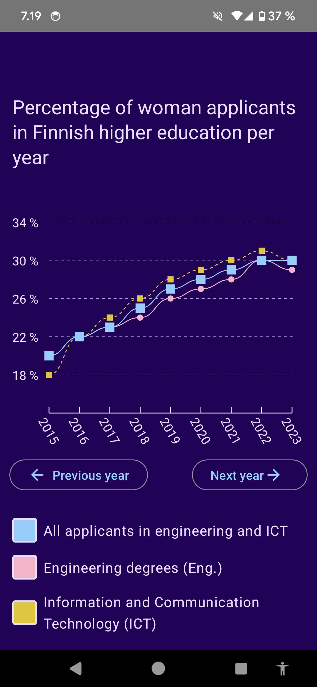
So, one way to solve this problem with path-based gestures is to add visible buttons as an alternative way of navigating inside the graph. In the case of this graph, we want to add two buttons: One for going forward and another for going backward. This is what the UI will look like once we add the controls:

We add a new component, called ControlButtons that wraps these buttons:
@Composable
fun ControlButtons(
    highlightedX: Float?,
    lastIndex: Int,
    setFocus: (Int) -> Unit
) {
    ...
}
It takes three parameters: highlightedX, which is the currently highlighted year on the x-axis, lastIndex, which is the last year's index, and a function called setFocus, which takes in an integer - the index where the focus should go next - and returns Unit. This is what it looks like when we call it in the parent component:
ControlButtons(
    highlightedX = highlightedX,
    lastIndex = pixelPointsForTotal.count() - 1,
) { selectedIndex ->
    highlightedX = pixelPointsForTotal[selectedIndex].x
}
So, we pass in the highlightedX that we have been using to define the currently highlighted year, the last index for pixel point lists, and then, in the lambda block, we take in the new selected index and set the highlightedX to the x-value in the pixel point list in that index.
Let's get back to the ControlButtons composable. At the beginning of the composable, we'll define two things:
// ControlButtons

var selectedIndex by remember {
    mutableStateOf(-1)
}

fun setSelectedIndexAndFocus(newIndex: Int) {
    selectedIndex = newIndex
    setFocus(newIndex)
}
First, we want to store the currently selected index to a selectedIndex variable, remember it and set the initial value to -1 as there is no index selected initially. We'll also want a function to set a selected index and focus to update the state within the component, and set the new highlighted year (or, x) on the parent component, as we saw a couple of paragraphs ago. We call it setSelectedIndexAndFocus.
After that, we'll have everything we need in that component to create the actual buttons. As they're pretty similar, we'll make a new component called ControlButton that takes in type (we'll talk about it a bit later), currently selected index, last index, first focus index (so, where the focus should go first when pressing this button if nothing is selected), highlighted X value, and a function to set the focus:
@Composable
fun ControlButton(
    type: GraphControlType,
    currentIndex: Int,
    lastIndex: Int,
    firstFocusIndex: Int,
    highlightedX: Float?,
    setFocus: (Int) -> Unit,
) {
...
}
To make the function a bit more abstract in order to work for both the next and previous years, I made an enum called GraphControlType:
enum class GraphControlType {
    Next {
        override val icon = Icons.Filled.ArrowForward
        override val textResId = R.string.button_next_year
    },
    Previous {
        override val icon = Icons.Filled.ArrowBack
        override val textResId = R.string.button_previous_year
    }, ;

    abstract val icon: ImageVector
    abstract val textResId: Int
}
This enum contains the icon we want to use and the resource id for the text in the button.
As mentioned, the idea of the button is that it moves the focus to the next year when pressed. If it's the "next year" button, it would go forward from last year to the first one. If it's the "previous year" button, it would go backward; when it's in the first year, it would go to the last year.
We have helper functions for getting the next index (or, year) to focus (you can see them in the commit containing all the changes), and we want to define which one to use, depending on the type that we passed:
// ControlButton

val nextIndexFunc = when (type) {
    GraphControlType.Next -> ::getNextIndex
    GraphControlType.Previous -> ::getPreviousIndex
}
Now that we've defined everything, we'll add the button:
// ControlButton

OutlinedButton(onClick = {
    val newSelectedIndex = when (highlightedX) {
        null -> firstFocusIndex
        else -> nextIndexFunc(currentIndex, lastIndex)
    }

    setFocus(newSelectedIndex)
}) {
    if (type == GraphControlType.Previous)
        ControlButtonIcon(icon = type.icon)
    Text(stringResource(id = type.textResId))
    if (type == GraphControlType.Next)
        ControlButtonIcon(icon = type.icon)
}
So, in the onClick handler of the button, we check if the highlighted x-value is null, and if it is, then we move the focus to the first focus index, which is the first index for the "next year" button, and the last index for the "previous year" button. Otherwise, we'll use the defined nextIndexFunc to get the next index where the focus should go. Once we have the index, we call the setFocus-function with that index.
In the content of the button, we use the type to define the placement of the icon - for the "previous year" button, it's before the text, and for the "next year" button, it's after the text.
The final thing is to add the controls to the ControlButtons-composable. We want them to be on the same row, so we wrap them with the Row-component. I've left out some modifiers for clarity:
// ControlButtons

Row(...) {
    ControlButton(
        type = GraphControlType.Previous,
        currentIndex = selectedIndex,
        lastIndex = lastIndex,
        firstFocusIndex = lastIndex,
        highlightedX = highlightedX,
        setFocus = {
            setSelectedIndexAndFocus(it)
        },
    )
    ControlButton(
        type = GraphControlType.Next,
        currentIndex = selectedIndex,
        lastIndex = lastIndex,
        firstFocusIndex = 0,
        highlightedX = highlightedX,
        setFocus = {
            setSelectedIndexAndFocus(it)
        },
    )
}
Okay, now we have added the controls. Here's a video of how they work:
You can find the final code from this commit.
Switch Access
The initial implementation for keyboard access did not work on a switch device. When I was testing it with the switch, I noticed that the focusable elements are not available to the API a switch device uses, so the implementation did not work. I don't know why this happens; I haven't had time to investigate it further, but if anyone knows more about the technical details behind this behavior, I'd be glad to learn more!
This is also an excellent example of why you must test with different assistive technologies. Assuming that something works without testing might lead to some inaccessible code.
So, you might wonder what the app now looks like for a switch device user. I recorded a short video:
As you can see in the video, adding these buttons allows a switch device user to change the highlighted year and see the percentages for each year.
Considerations
This implementation has some considerations from the accessibility point of view. If I had started with these controls, I would probably have built the whole graph a bit differently from a screen-reader and keyboard user perspective, but this time, I was building on top of the previous blog posts, so that was a constraint. I'll share some concerns about this implementation and the reasoning behind my decisions.
Non-Descriptive Buttons
First, the buttons in the UI have text content saying "Next year" and "Previous year," and when a screen-reader user presses those buttons, nothing happens, especially if they're non-sighted or have turned the screen off. This is because even though we move the currently selected year, we don't move the accessibility focus. Or focus at all, for that matter.
If I had added the button controls first, I would probably have made the Labels component, which contains the selected year's values, into a live region. That way, every time the content changes when the year changes, the content would have been announced.
Also, I could have added that to this version, but I wanted to keep this blog post as simple as possible. Also, if a user navigates linearly, they would first encounter the graph and the data before hitting the buttons. That way, there would be context for buttons and a way to navigate through the years. If they are not navigating linearly, then the situation can be different, depending on the mode they're using.
Additional Tab Stops
Another consideration is that this implementation creates additional tab stops for a keyboard user. It's only two, but if every time you press a key is painful, those two can be too much.
In this case, a similar implementation I described for screen-reader users would also be better for keyboard users. That would reduce a lot of tab stops from the graph and replace them with just these two buttons. Of course, a button needs to be activated with a keypress, so there's that.
Wrapping Up
In this blog post, we've looked into how to add visible controls for navigating the graph. This approach has solved issues for those who might have trouble with path-based gestures or use a switch device. We've also looked into some considerations this implementation has related to screen-reader and keyboard navigation.
This blog post series has provided two approaches to solving issues with pointer input-based graph navigation so far: Adding an overlay and focusable areas on top of the years in the graph and adding control buttons. As every app and use case is different, you might need one or both of them to make your graphs more accessible - or, in some cases, a different type of solution can be the answer.