Toggle Labels With Icons - Personalizing Accessibility
Reading time: about 8 minutes
Published
Personalizing Accessibility (3 part series)
As mentioned in my previous blog post, Personalizing Accessibility with Settings, accessibility for the broadest group of users often requires some personalization. What is accessible for one might not be accessible for another.
In this blog post, I will discuss one example of accessibility issues that could be solved with the help of settings: Icons and the need for text labels accompanying them. As you can see from the next section, this particular issue is personal to me, and I wanted to give an example of how to solve it.
Why?
Icons are not universal. I can't tell you how many times I've opened an app, seen icons (without labels), and wondered what the heck they mean. Where do they lead me? What happens if I press the button with an icon? Do I get to the place I'm looking for? Or does my phone explode? Who knows. The UI is not communicating it to me.
I know UX people say that it's about learning. "If you just use the app for long enough, you'll learn". But the thing is, I've had a TBI, which has affected... You guessed right, my memory. So, I find it super frustrating when there are all kinds of symbols I don't understand without text labels, and I have no idea what to do with them. These apps make me frustrated. And that's not the goal of an app, right?
On the other hand, I know some people benefit from not having those labels present. Also, almost every designer I've talked to about this topic seemed to think that having text in the UI is ugly (yes, I'm exaggerating a bit.) So, I'm coming up with a solution to help both groups - those who need the labels and those who don't need them: Personalization — a setting in the app to toggle showing labels with icons.
How?
This section will present one way to add this toggle in settings. It's not a complete solution, as the actual implementation varies based on your app's architectural patterns. It aims to provide guidelines on how to do things by showing one example.
Settings Data Store
The first step is to add settings where the user can toggle whether labels are shown in the app UI. Adding settings has two parts: the settings screen and storing the setting value.
Let's start with the latter. I'm using Preferences DataStore in the example app I'm building, as it's perfect for storing simple data, such as setting values. Let's first add the dependency (check the latest version from the link):
// build.gradle.kts

dependencies {
    implementation("androidx.datastore:datastore-preferences:1.1.0")
}
Then, the data store needs to be initialized. As the example app uses dependency injection with Hilt, let's do that in a SettingsDataStoreModule where we define the datastore provided for Hilt.
First, let's initialize the data store:
// SettingsDataStoreModule.kt

private val Context.datastore: DataStore<Preferences>
    by preferencesDataStore("settings")
And then provide it:
// SettingsDataStoreModule.kt

@Singleton
@Provides
fun provideSettingsDatastore(
    @ApplicationContext context: Context
): DataStore<Preferences> = context.datastore
Now that the data store has been initialized and can be accessed via dependency injection, we need to add the actual setting storing. In this example application, we're reading the values from the data store in the repository to make this demo straightforward.
The data store is injected into SettingsRepository, where we define the flow the app will observe and a function to toggle the value. First, let's define the key for storing the setting value for showing the labels:
// SettingsRepository.kt

private object PreferencesKeys {
    val showLabels = booleanPreferencesKey("show_labels")
}
Next, let's define the flow:
// SettingsRepository.kt

val showLabelsFlow: Flow<Boolean> = dataStore.data
    .map {
        it[PreferencesKeys.showLabels] ?: true
    }
We read the data from the data store and get the showLabels-preference. If the value from the data store is null, we set the default to true, like the first time the value is accessed. Why true, you might ask? Well, it's both a personal choice, but it's also because I believe that the more accessible value should be the default because there is a lot of power with the default. If you want to learn more about that theme, I've written a blog post: The Power of Default.
There's one more thing: The user must be able to toggle the value. Let's add a function for that:
// SettingsRepository.kt

suspend fun toggleShowLabels() {
    dataStore.edit { preferences ->
        val oldVal = preferences[PreferencesKeys.showLabels]
        preferences[PreferencesKeys.showLabels] =
            (oldVal ?: true).not()
    }
}
It's a suspend function, as the data store's edit function takes in a transform suspend function, where the values can be updated. We then get the old value and set the opposite boolean as the value - so, if the old value is true, then false, and vice versa. Here again, we use true as the default value if oldVal is null.
Settings in ViewModel
The next place in the flow is the ViewModel, which is used to get the stored values to the UI. Again, to keep this simple, we're using as simple a ViewModel as possible, and your project's implementation might differ.
As I'm using Hilt in my project, SettingsRepository is injected into the SettingsViewModel so the function and flow we defined in the previous section are available. Let's first define the state variables:
// SettingsViewModel.kt

private var _showLabelsEnabled = MutableStateFlow(true)
val showLabelsEnabled = _showLabelsEnabled.asStateFlow()
Then, we add a function to collect the value from showLabelsFlow and call it in the view model's init-function.
// SettingsViewModel.kt

init {
  getShowLabelsEnabled()
}

private fun getShowLabelsEnabled() {
    viewModelScope.launch {
        settingsRepository.showLabelsFlow.collect {
            _showLabelsEnabled.value = it
        }
    }
}
Finally, we add a function to toggle the setting and use the function from the repository:
// SettingsViewModel.kt

fun toggleShowLabelsEnabled() {
    viewModelScope.launch {
        settingsRepository.toggleShowLabels()
    }
}
All right, the next thing to do is add the actual UI and use these state values and functions we defined.
Settings Screen
The settings screen is simple. At this time, there is only one switch to toggle the setting value:
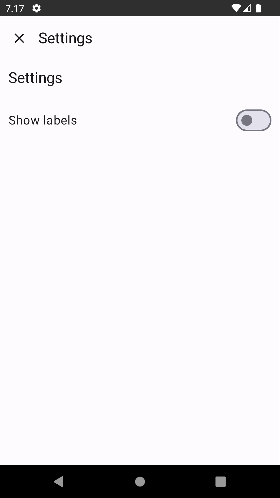
I won't go through the whole code for the screen here, but I want to point out one accessibility detail from it. When adding a switch, it needs a couple of lines of modifier magic to make it more accessible:
// SettingsScreen.kt

@Composable
fun ToggleSwitch(
    checked: Boolean,
    label: String,
    toggleValue: () -> Unit
) {
    Row(
        modifier = Modifier
            ...
            .toggleable(
                value = checked,
                role = Role.Switch,
                onValueChange = {
                    toggleValue()
                }
            ),
    ) {
        Text(label)
        Switch(
            modifier = Modifier.clearAndSetSemantics {},
            checked = checked,
            onCheckedChange = { toggleValue() },
        )
    }
}
I've left some unrelated code out, but the main point is that the text label is not associated with the switch for Accessibility APIs unless we wrap them both with a Row (or other layout component), add a toggleable modifier for it, and then set clearAndSetSemantics for the Switch component. You can read more about why in a blog post I wrote: Improving Android Accessibility with Modifiers in Jetpack Compose.
Check for Settings Value
Okay, now that we have added the ability to toggle the setting, the final thing is to use the setting value in our UI. What we are building here is a simple UI, which has a couple of message cards for the internet that look like this:
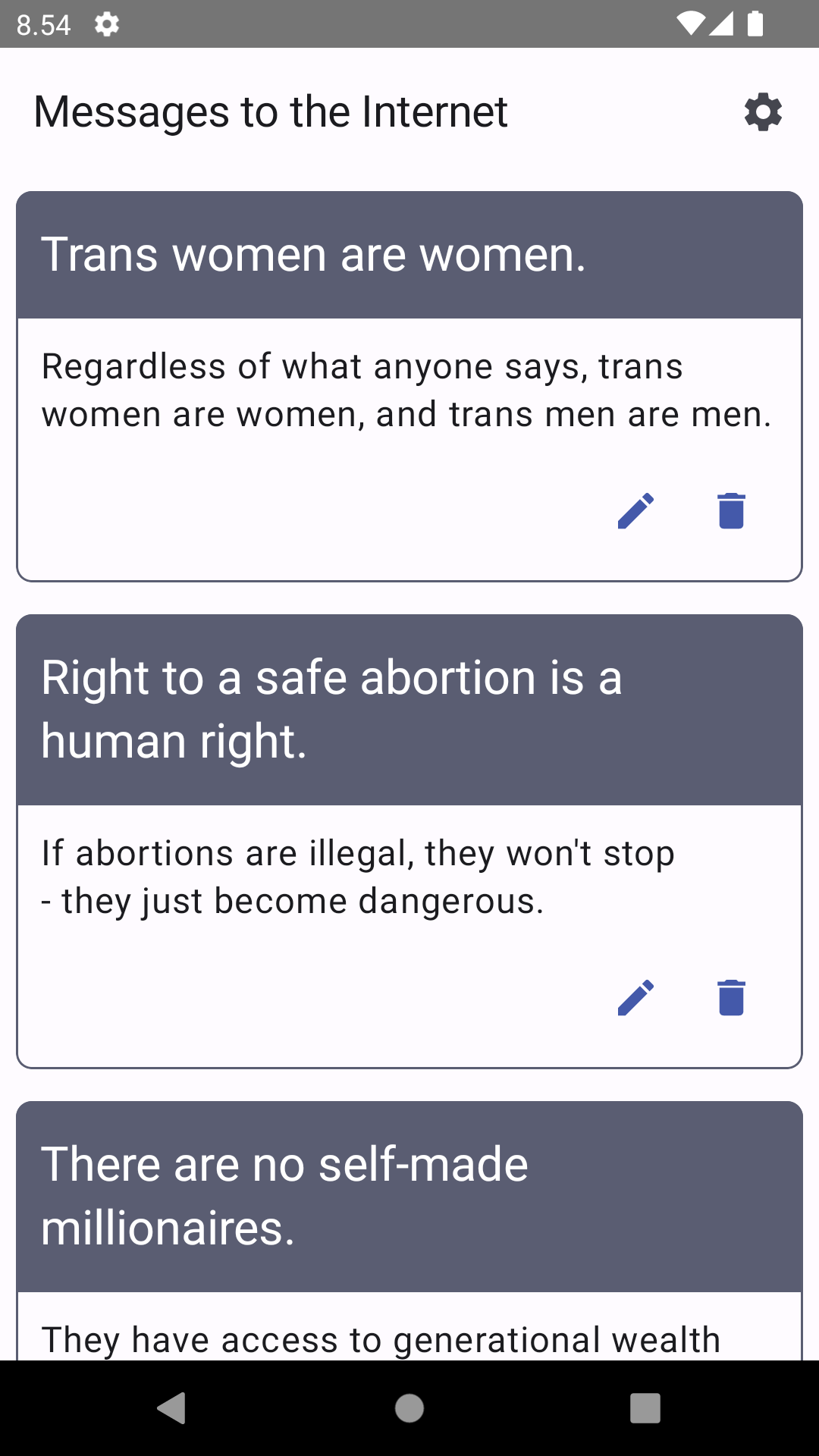
As you might have guessed, we want to toggle showing labels for the pen- and trash can icon buttons. The screen uses the same view model as the Settings screen (SettingsViewModel) for simplicity. In a non-demo application, each feature would most likely have its own view model.
So, there's the CardsScreen to which we're passing the view model:
// CardsScreen.kt

@Composable
fun CardsScreen(viewModel: SettingsViewModel) {...}
Inside CardsScreen, we want to collect the showLabelsEnabled value from the view model as a state:
// CardsScreen.kt

val showLabels = settingsViewModel
    .showLabelsEnabled
    .collectAsState()
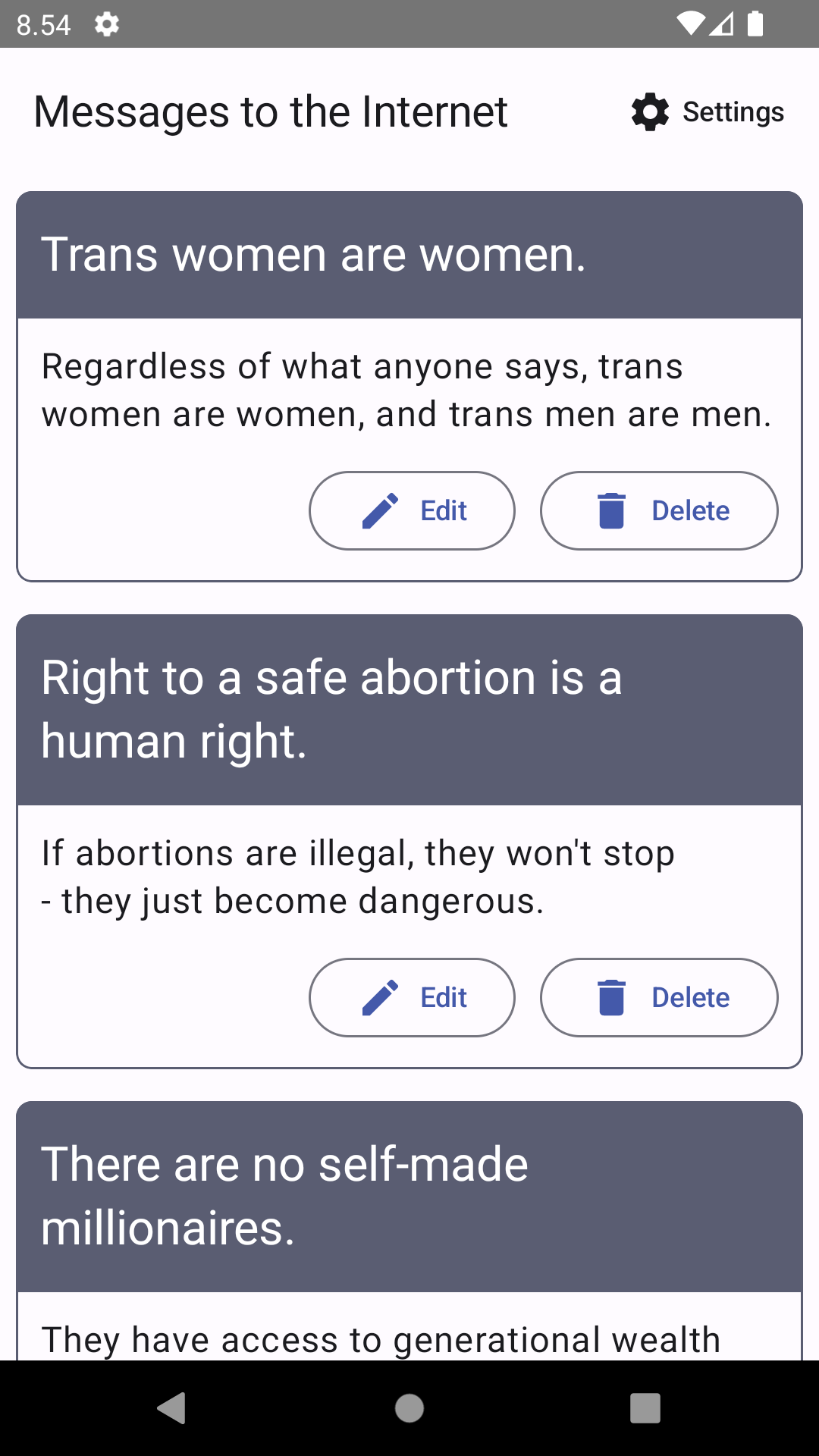
And finally, we want to use that value to determine if we're showing the labels or not. The icons in the picture above are IconButtons, and we want to use OutlinedButtons for the labeled ones. To make the code more modular, there are different components for buttons. For the labeled version, we have the following:
// CardsScreen.kt

@Composable
fun ButtonsWithLabels() {
    Row(...)
    ) {
        OutlinedButton(onClick = { /*TODO*/ }) {
            ButtonContent(
                text = "Edit",
                icon = Icons.Filled.Edit
            )
        }
        OutlinedButton(onClick = { /*TODO*/ }) {
            ButtonContent(
                text = "Delete",
                icon = Icons.Filled.Delete
            )
        }
    }
}
And ButtonContent looks like this:
// CardsScreen.kt

@Composable
fun ButtonContent(text: String, icon: ImageVector) {
    Row(...) {
        Icon(
            imageVector = icon,
            contentDescription = null,
            tint = MaterialTheme.colorScheme.primary
        )
        Text(text)
    }
}
The code for the non-labeled version is:
// CardsScreen.kt

@Composable
fun ButtonsWithoutLabels() {
    Row(...) {
        IconButton(onClick = { /*TODO*/ }) {
            Icon(
                imageVector = Icons.Filled.Edit,
                contentDescription = "Edit",
                tint = MaterialTheme.colorScheme.primary
            )
        }
        IconButton(onClick = { /*TODO*/ }) {
            Icon(
                imageVector = Icons.Filled.Delete,
                contentDescription = "Delete",
                tint = MaterialTheme.colorScheme.primary
            )
        }
    }
}
The main difference (apart from the labels) is that the icons' content descriptions are null for buttons with labels, as the text is part of the button content and doesn't need to be repeated.
Next, let's check the value of enableLabels and set the component accordingly:
// CardsScreen.kt

if (showLabels)
    ButtonsWithLabels()
else
    ButtonsWithoutLabels()
And that's it. When the setting is toggled on, the cards look like this:
Wrapping Up
In this blog post, we've looked at one way to store an app's accessibility settings and personalize the UI accordingly. The examples have been, well, examples to demonstrate ideas, and on a production-level app, you probably have a bit more fine-tuned setup.
The next blog post about accessibility and personalization will be about adjusting the app's theme by providing an option for selecting either the system default theme, dark theme, light theme, or a high-contrast theme.
Links in the Blog Post
- Personalizing Accessibility with Settings
- Preferences DataStore
- The Power of Default
- Improving Android Accessibility with Modifiers in Jetpack Compose
Comments
